Reader profile research
What is a reader profile?
It can refer to a profile of an individual that includes self-reported information designed to give people a picture of who that person is, a demographic analysis of site users developed by a company for advertisers who want to know if they will be a good fit for that company, or a profile developed by a content creator with the goal of determining who content is being produced for so that it can be tailored for the audience. In all cases, a reader profile provides information about people engaging with online content, and this information can be used to make that content more relevant to the interests of readers.

The reader profile above was produced by XXL, one of the leading advocates for R&B and rap; it is one of the most influential music magazines on the market today. Their target audience are male as 78% of their readership comes from the male consumer over half of which are of African American descent. less than half of their readers are college educated and the median age of these readers is 27; they must create a more masculine orientated magazine with content that reflects their lifestyle and general things that the reader likes to see included.
Key features
The key features of a reader profile include statistics, music and how they wish to improve their relationship with the targeted. Regarding statistics the key stats are based on the male to female readership, median age, ABC1 and circulation. Music shows what the institution have discovered by researching how much their target audience relies on the content of the magazine to keep up to date with the music out there. The principle of this is to understand the audiences wants and needs better in order for XXL magazine to make appropriate changes that are based on the research carried out. The target audience and the institution must have a good relationship with each other in order to gain trust from the consumers of a magazine like XXL.The average age for the magazine is essential as it determines the language of the magazine. For example, if the average age was 15 than aspects of the magazine would only be suitable for that age group specifically so that the language reflects the audience. Also understanding the target audience's interests and hobbies may mean that people will feel like they are not being ignored, which increases the sales of the product potentially. Sometimes included is the social class that belongs to the target audience so that they can reduce or even increase prices so they can maximize profits.
How the magazine is distributed
It is conventional for magazines to be distributed to stores as the highest demand for magazines are in shops for customers to buy the physical copy. But recently magazines have been made available to buy and download from online to improve convenience and prices for the consumer as the distribution costs nothing online. The market research that would have had to be done shows how committed some institutions are to gaining customer satisfaction.
Purpose of reader profile
The principle of a reader profile is to better understand who a magazine's target audience is and to see why that is and if it lies within their interests. This is so the music magazine can get an insight into what the reader would appreciate to see the most in side the magazines of the future, to ultimately increase their overall readership and make the experience of the read more enjoyable for the target audience.
How will a reader profile sell a magazine product?
It will contribute greatly towards the sales of the magazines as all the content in side will be based on the research that a magazine has carried out to better understand their audience to make the subject of the magazine more relevant to the target audience reading it. In terms of design after all the research is gathered a new template can be decided based on the average reader that consumes the magazine on a regular basis.


 One of the key aspects that an institution of a music magazine should consider are; who their target audience are and the interests that they have. I will stick to the needs of my target audience by doing market research through the use of surveys for instance. The price for my RNB magazine will not be cheap as the people that are interested in this music genre have a sufficient class and status. Therefore, they can be more flexible than others with their money and after deciding on a social group you must research what free gifts/prizes the audience like, this is a great way of keeping the audience intrigued if nothing else. The social class table will help me with my feature stories and target audience as I will use it as a guideline to show what should be restricted from a specific social group so that it compliments my specific audience.


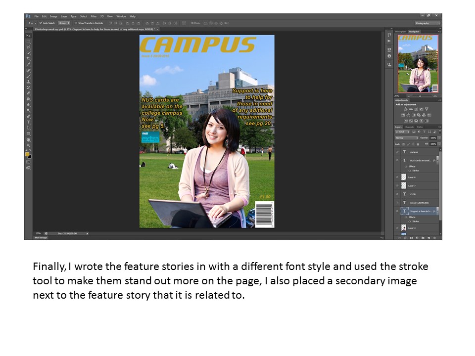
 I used the back pack prop to show the link to college and education as most people carry one round when they are carrying documents, pens and other utencils for college life.


