
Thursday, 20 April 2017
Sunday, 16 April 2017

Monday, 10 April 2017

Friday, 31 March 2017
Q.1 In what ways does your media product use, develop or challenge forms and conventions of real media products?

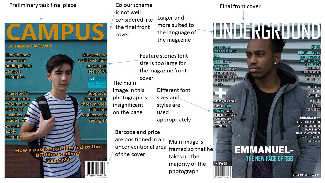
Colour scheme
The colour scheme of my magazine is blue, white and light grey. These colours that I decided to use on my front cover were well considered before hand. I decided to use the colour grey, to reflect the contemporary feel of the artist and magazine. White was chosen for its simplicity, and blue was the colour that I thought would work the best on the cover because of its connection to independence, which has a clear link to the artist and magazine for they are independent. Whilst choosing colours with the positive connotations I had to put in to consideration whether they would work well together as a colour scheme, I was lucky to have found the perfect set of colours for this magazine. In terms of the conventions of colour in the R&B genre I see it tending to vary depending on the artist on the cover of the magazine. In the example, above, Chris Brown is portrayed as a gangster. The gold chains and the dress code is a clear indication of this. I feel that too many artists are told how to look and how to act when in front of the camera. I get that impression with a lot of the real media texts I have seen, as I see the colours used as a false representation of how the artist really is. I personally don't see Chris Brown as a thug or whatever he is represented as in this photograph, I see him as an R&B artist, who's reputation in the industry is huge, he deserves a bit more freedom to select his own range of clothing. I could understand if the artist dressed like a pop star but sang R&B as that would not be how the genre wants to represent itself but for someone that understands the connotations or actually dresses like they are supposed to then there is no need for a change of outfit.
Font
The font used on my magazine conforms to the conventions of the R&B genre as it is bold, modern and simple. You may have noticed that in the R&B genre it is conventional for media products to have an impact on the media products that they are printed on. This is done because the institution that owns the magazine wants to grab the readers attention, often with the main headline in very large sizes to convince the reader that this is a great magazine and it is worth reading because of these major headliners.
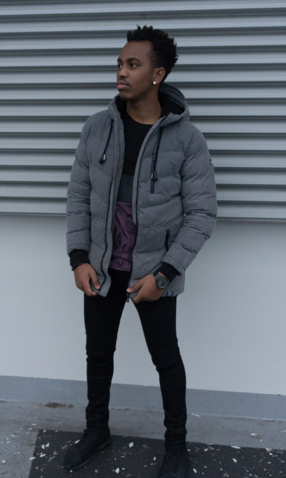
Mise en scene
The photograph I chose for the front cover of my magazine was selected specifically because, I knew it would fit not only the conventions of real media products, but the layout of the cover it self. I decided that my model would wear clothes that he would select himself but also clothing that reflected the artist and genre.
Conform
|
Challenge
|
Develop
|
The font style and size
|
Colour scheme
|
Location
|
Layout
|
Title (Part of layout)
|
A stronger urban aesthetic
|
Mise-en-scene
|
No use of direct address from image of
model on my front cover
|
The portrayal of the artist by letting
the model improvise with their chosen expressions.
|


I may have challenged the conventions of a real media R&B product quite a bit, but I don't regret it as I believe I have developed it in most areas of the page. I will analyse the differences below, by going through the conventions to see how mine challenges or develops the real media products.
Colour scheme
I have kept the house style of my media product the same throughout my media products as it is a convention to keep the colour scheme similar in a magazine. I have however, used different font styles and italics on my text, I will talk about this below.
Font
I have used a variety of fonts on the contents page to show variation of styles that suit the genre. However I might have made a mistake with the choice of font on the editors note but if I have time to fix that then I will.
Mise en scene and layout
The way in which the artist has been positioned was designed purely for the contents page I in visioned. I have used a long shot to show the artists full body as this is a convention for contents pages. An example of this can be seen on the example above.
Conventions that conform to my contents page
|
Challenge
|
Develop
|
The shot of my model
|
The layout and distribution of image and text
|
Font size and variation
|
Colour scheme
|
Reducing the font size for the feature stories
|
Layout
|
Mast head
|
Graphics like the tape on the side of the image
|
Addition of editor’s note
|

Again I have used the same house style for this double page spread that I produced because it is conventional to use the same set of colours throughout the magazine.
Font
I have used different fonts for the quotes from my model to engage the reader and encourage them to have a look at the article about the main feature story.
Mise en scene
The artist is using direct address to appear more engaging to his audience so that they feel more inclined to find out who he is, and what he does. In terms of the costume I feel I could do more with it for this double page spread but I will only make changes if I can find the time to.
Thursday, 23 March 2017
Tuesday, 14 March 2017
Q.3 Who would be the audience for your media product?
Audience for my magazine
The audience for my magazine would be young people aged around 16-23 years that want to know about the latest songs or artists coming up on the independent R&B scene. They support the cover artists by buying my issues of the magazine and sharing it with others so that they can eventually move on to better things like working for major labels that will promote them better then we can, it is an honor to have interviewed some of the new and upcoming prospects as we can see them becoming big stars one day, it will be down to our fantastic audience.
In order for this audience to appreciate my magazine in the best way possible I considered what they would like from the product more than anything. I decided that convenience and relatability would be the two key things to make this magazine stand out to the others, convenience because that is what people at that age expect from products these days, if they don't have to go in to a store to buy the magazine then they will purchase it on one of their devices, like the mobile phone which allows portability so they can read it on a compact system that they will have with them all the time. With relatability I mean how the artist and audience connect to each other so with every cover artist I will have their twitter page so that they can become more familiar with these faces.
Wednesday, 8 March 2017
Saturday, 25 February 2017
Q.5 How did you attract/adress your audience?
The approach that I took to attracting my audience was not a simple process as I had to reach out to my mass audience by researching their spending habits as consumers so I could find out what would appeal to them, in order for the magazine to have a style that my audience would like to see in the magazine for they will relate to the language of the product. The house style is one of the most important aspects of attracting not only the existing customers but potential new ones as well, the conventional style and approach might mean that the consumers of other RNB magazines will appreciate what it has to offer because I have not tried to make my magazine different to the existing products on the current market. Another way I have addressed my audience is by promoting the product on social media sites, including Facebook and Twitter as it is a great way of advertising to your mass audience as it can be shared and then commented on so it is also a good way of making improvements on the product.
I appealed to a target audience between the ages of 16 and 23, although also attempted to address slightly older readers. I targeted this audience in the following ways:
I appealed to a target audience between the ages of 16 and 23, although also attempted to address slightly older readers. I targeted this audience in the following ways:
- The colour scheme is conventional for the average R&B magazine and highlights key features and promotions on the magazine and appeals to my young target audience.
- I chose a model who is a similar age to my target audience so that they can relate to him.
- The artists I chose to include in my magazine were those popular to my audience, which I discovered through research.
- My feature stories were covered stories that were relevant to a younger generation.
- The dialogue I included in my product was written in a tone that was informal so that it would appeal more to my target audience.
Tuesday, 21 February 2017
Q.6 what have you learnt about technologies from the process of constructing this product?
This process of constructing my music magazine started in the preliminary task, since then I have had to apply more advanced technological processes by using more advanced tools on editing software for the construction of my music magazine. The full process of constructing this magazine involved a lot of forms of media to present my work and different application to produce the work and upload it onto blogger.
When producing my magazine with its colors, images and structure, I used the editing software Photoshop in order to have a lot of freedom as to how I wanted my magazine to look like as the finished product. Photoshop had definitely enabled me to conform to my magazine's genre as there are various tools with different abilities for each. Also, to navigate across the controls and tools there was a navigation/toolbar that was situated on the left of the interface on the Photoshop software. It contained all the tools available in Photoshop below I have highlighted some of the tools I had used.

I utilized the camera to the left to its advantage, I have been studying photography alongside Media and have learnt how to use the functions on it as best as possible. I bought it before the course began as I was upgrading from another model to this one for my A-level photography. The wider aperture and larger sensor gave me more flexibility in post as I would not have to worry about there being much image compression like my last camera. Also it has manual focus and is extremely compact, the benefits of this when shooting my model are that I can take my time making a better image whilst looking discrete with a less obvious professional camera.
I also used the blogger software in order to produce my posts and uploaded the content onto my blogger page. During the process of using this software, I had learnt a lot in terms of how to produce a post with a variety of different forms of media e.g, (images, slide-share and Prezi). I used these forms of media to present my work in a more creative way. I managed to place images on my blog posts by saving my images as JPEG format and uploading them directly from Blogger onto my blog post. This process was carried out with the image above of the camera and the PowerPoint image above that. With Prezi and Slide share I had managed to upload them by embedding the data from the two software's and pasting them into the HTML option on the toolbar of my blog posts.
With the Prezi software, I had found a new alternative of how to present my work. With this software, I was able to type up paragraphs within circles. It made my work appear more creative and is effective on showing that I have more of an understanding towards media technology as I have used a variety of media technologies to present my work effectively.
Another media software I have used to present my work is Slide-share which is a software that enables my work to be presented like a slide show and can be navigated by the user looking at the slide share uploaded.
To conclude all the technologies I used have taught me the possibilities of what you can produce and has given me more confidence with the software's as I am now more familiar with how everything works.
Friday, 17 February 2017
Thursday, 12 January 2017


Saturday, 7 January 2017


Subscribe to:
Comments (Atom)